canvas
#F1F0EBPrimary page background · --bg

Africa Ebony · Design system · v1.0
The visual language behind Africa Ebony: quiet, tactile and editorial. This living reference documents the exact foundations, type, components and responsive rules used across the storefront.
01 / foundations
#F1F0EBPrimary page background · --bg
#10100FHeadings, controls and active states · --text
#DEDDD7Browser canvas
#E8E7E1Quiet component surface
#E6E5DFEditorial section contrast
#5F5E58Supporting copy · --muted
#CECDC6Dividers and input rules · --line
#070707Deepest material tone
Use near-black against warm off-white. Pure white is reserved for negative space inside photography, not as the page canvas.
Product photography uses natural shadows, contain sizing and multiply blending so carved objects feel placed rather than pasted.
One-pixel warm-grey rules separate content. Large blocks rely on spacing before borders, shadows or decorative surfaces.
02 / typography
Primary sans serif
Aa Bb Cc Dd Ee Ff Gg
0123456789 — & ↗
assets/css/styles.css:1assets/fonts/FONT-LICENSES.mdArabic companion Noto Sans Arabic · weights 300–600 · SIL OFL 1.1.
System fallbacks Helvetica Neue, Arial and Georgia are referenced from the visitor’s operating system and are not distributed inside this theme.
Display XL · clamp(4.5rem, 10vw, 10rem)objects
with memory.
Display L · clamp(3.5rem, 7vw, 7.25rem)carved by hand.
Heading · clamp(3rem, 6vw, 6.25rem)nature’s depth.
Section title · clamp(1.15rem, 2vw, 1.7rem)The complete collection
Body · .84rem / 1.8Every piece begins with the grain. The material guides each cut, leaving a record of time, place and the maker’s hand.
UI · .78remshop · journal · buying guide · contact
Micro · .68rem / 0.12emHAND-CARVED · WEST AFRICAN EBONY
Headings weight 300–400 · tracking −4% to −7.5% · line-height .82–.95
Body weight 400 · neutral tracking · line-height 1.7–1.9
Labels uppercase · tracking 10%–14% · muted ink
Currency tabular reading · lowercase UI context
03 / components
buttons
Pill radius: 99px · transition: 200–300msform fields
Underline fields · 1px rule · no filled containerradius
Use only where touch or imagery benefits8px field option
18px product image
26px feature panel
99px action pill
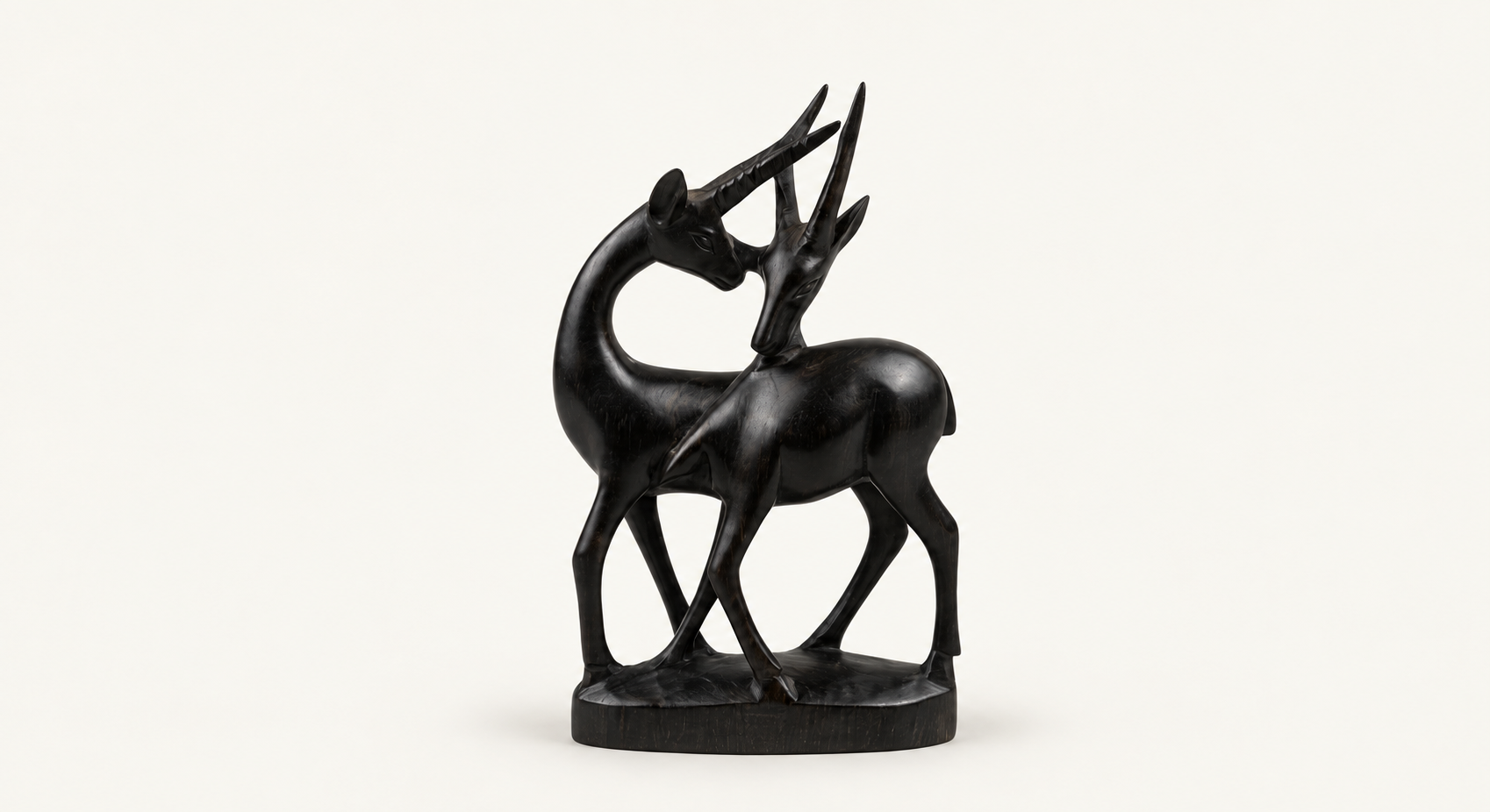
Product card anatomy · 01
04 / layout
global gutter
desktop grid
tablet breakpoint
mobile breakpoint
spacing scale
4px base rhythm · fluid spacing for large sections41 unit82 units123 units164 units246 units328 units4812 units6416 units05 / motion & access
Micro
Component
Ambient
Reduced motion All animation and transitions collapse to 0.01ms when the visitor requests reduced motion.
Keyboard Native buttons, links, labels and form fields preserve semantic focus and activation.
Touch Icon controls use a 32px visual frame; primary calls to action add generous horizontal padding.
Responsive type Display sizes use clamp(); the root drops from 17px to 16px below 620px.
implementation reference
Foundationsassets/css/styles.css
Shopassets/css/shop.css
Productassets/css/product.css
Editorialassets/css/blog.css + article.css
Informationassets/css/info.css
This pageassets/css/design-kit.css